


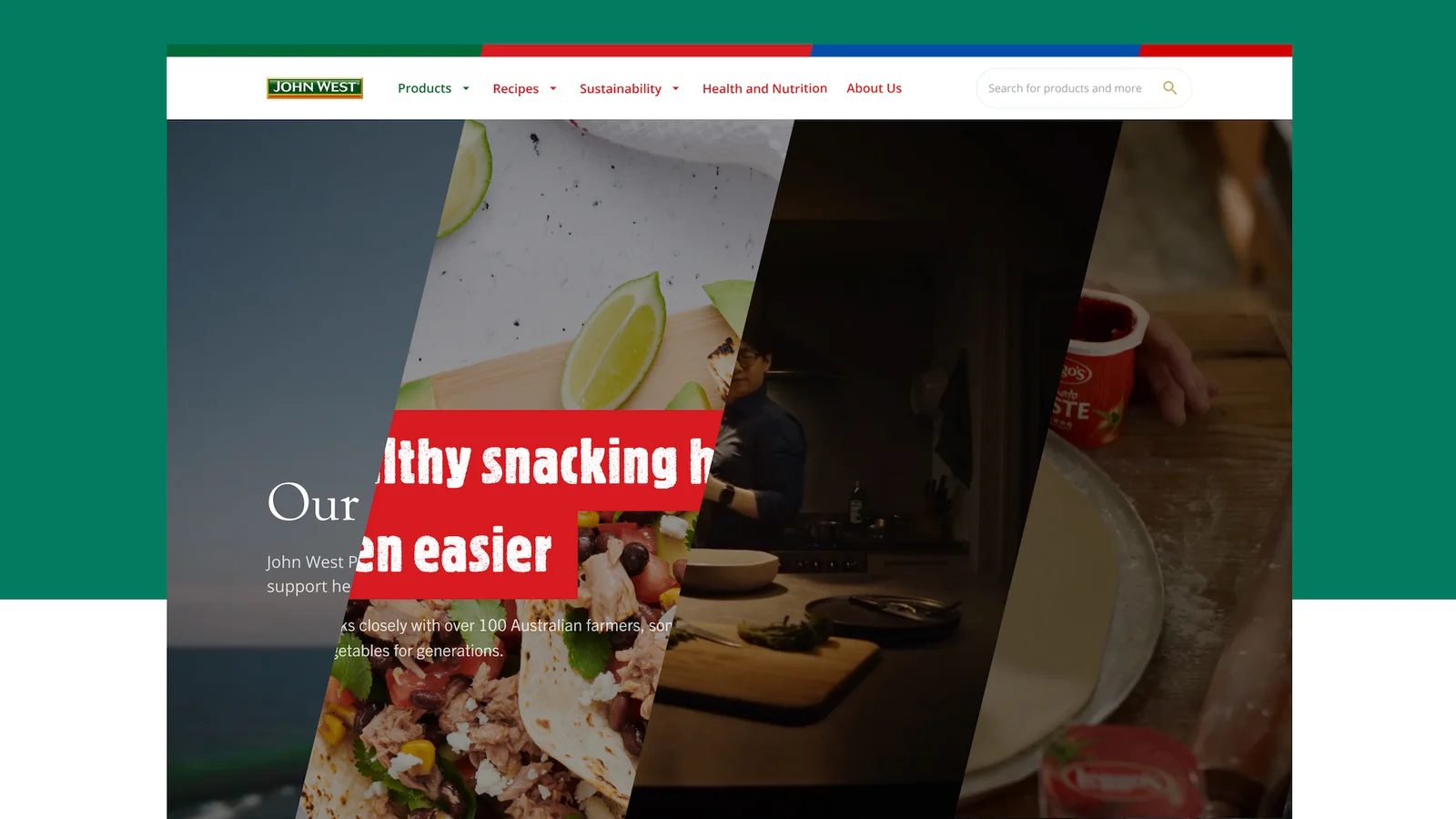
Some of Australia’s most iconic brands sit under the Simplot banner, including Leggo’s, Bird’s Eye, John West, Edgell and Simplot Foodservice. This Australian FMCG portfolio was acquired by agricultural giant, J.R. Simplot in 1995, with the brand's reputation has continued to reflect the highest quality of Australian-grown produce and global seafood.
The challenge
Simplot’s market share extends across multiple FMCG product lines and is the last Australian-grown frozen and shelf-stable vegetable provider of any scale in the country. It’s this commitment to Australian farmers and local jobs that has made Simplot's brands the easy choice for families. Despite the brand reputation, Simplot’s digital identity did not have the same prominence online and the hierarchy of brands and services under the banner was not clearly represented, and the existing websites did not offer consumers an opportunity to engage or be educated on the products.
The packaged food segment accounts for the largest share of the FMCG food market in Australia valued at $43.3 billion, which is expected to grow by 2.2% during 2020-2025. Simplot’s challenge was to grow its online presence with a research-backed strategy and compelling, easy-to-implement designs.
Our approach
The overall project scope included discovery, strategy and design with Luminary working with Simplot and their internal development team to realise and develop its new digital identity.
Quick stats
Customer engagements (research interviews, customer surveys and card sorting)
Minutes of customer interviews (√23 x 90 min customer interviews)
Hours of workshops across all workstreams
Mapping inter-department priorities
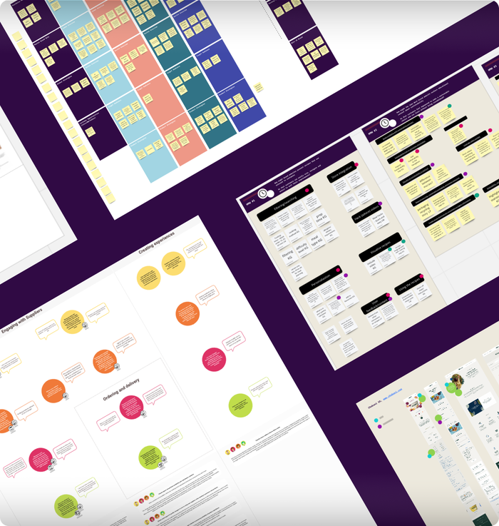
The discovery work included onboarding, workshops, research, technical discovery, ideation, customer journey mapping and more. Luminary’s research took on an immersive 360-degree view of the Simplot product lines, hearing from customers, supermarket stakeholders and Simplot employees. Card sorting guided this process and allowed inter-department priorities and customer journey map overlap to be identified, which lead to the restructuring and testing of Simplot's brand sites.
Wireframing the user flow
The team undertook a significant discovery process to determine how users were interacting with Simplot’s digital points. This required a high level of immersion with Simplot as it was important that all business units were involved. The extensive offering of the brand meant that there were department heads across all food categories, and oftentimes there were sub-categories within that area that all needed to be consulted to form a clear picture of the business operation.
Simplot’s existing data related to marketing campaigns, packaging and other product sales, but there was no qualitative data on how Simplot’s brand interacted online. The wireframe work was extensive and guided the development and prototype of key user flow.
Strategy
The strategy piece was informed by qualitative research, and dug into the key strategic themes that presented through competitor reviews, gap analysis reviews and the overall brand review. The technical review was presented to the USA team and corporate team so there was alignment across the board on what was being recommended. The review explored how a website was needed for product lines, and how consumers would get there.
An SEO analysis was put forward as part of the strategy work which included general housekeeping and an in-depth SEO migration plan for the Simply Great Meals website to the new Simplot website. A content audit highlighted opportunities for better cross-product linking, and metadata and overall content flow and complexity were assessed. The unique history of the Simplot brand was not as prominent on the website, and the strategy was geared towards spotlighting the brand history, sustainability and safe fishing processes that set Simplot apart. It was also put forward that strategic partnerships with celebrity chefs and influencers could drive greater visibility.
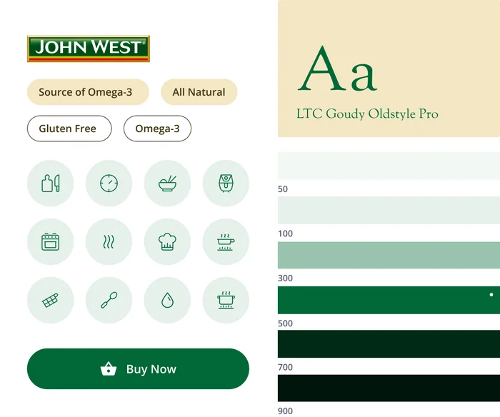
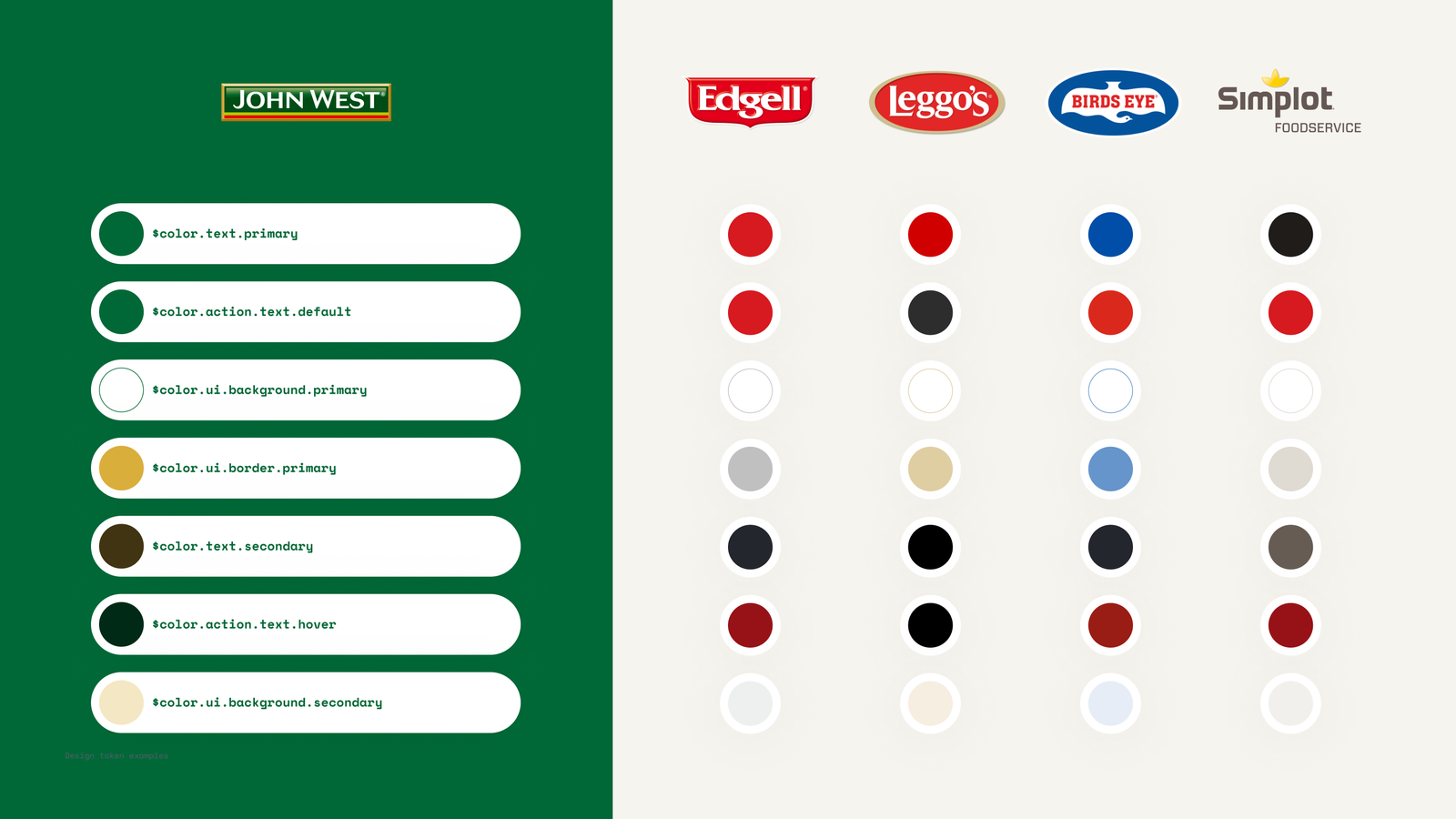
Multiple Brand Design System
A Multiple Brand Design System allowed Luminary to design a single brand website and then duplicate and customise it to the style of each brand. A centralised system saved design hours and upheld style guidelines. This approach provided a consistent and scalable design system management, with Simplots brand websites adhering to the same structure. This approach means that changes can be made in one place and propagated throughout the design system.
Establishing a new design system
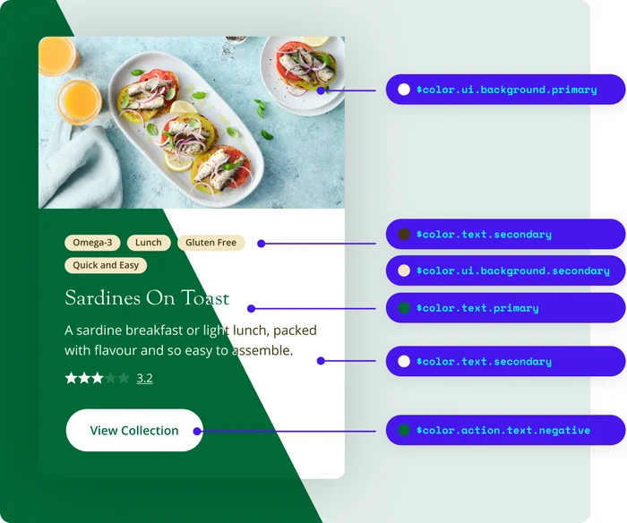
The Luminary Design team translated the existing traditional, static brand style guide into a living, breathing design system. This included unique design systems and tokens for John West, Edgell, Leggos, Birds Eye and Simplot Food Service., incorporating core typography and colour pallets. Additional tints and shades were developed to support the digital identity of each brand.
When the new design system was established, all five websites had design tokens that were assigned to colours, fonts, shades and buttons. A change to one website design token would reflect on the remaining four websites, allowing for seamless branding changes as if pulling a lever. Design tokens also give context to colours, visually signalling that one shade of green is for buttons and another one is for heading fonts, safeguarding against incorrect use.
Efficient and consistent design
When handing over the design token work to the development team, the benefit was clear. Rolling out five websites without design tokens would require an enormous amount of work, even if the websites were identical in terms of layout and component because fonts, colours and design elements would need to be manually switched out to abide by the brand style.
This design token strategy bolsters the core library and design system for the future, ensuring the client was set up for success and connects the same language to the designer and front end developer. The design tokens make scaling the website easy and consistent, eliminating decision-making and branding disruption.
Simplot design token video
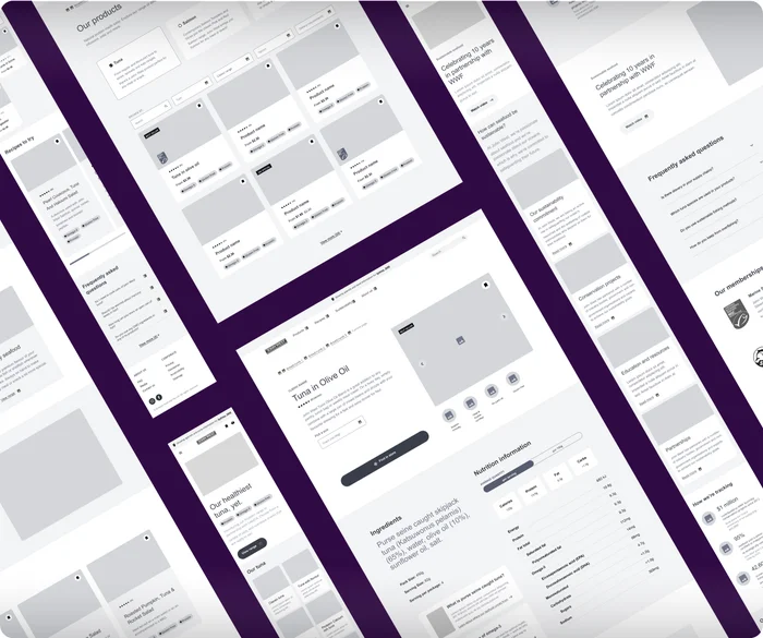
Products and Recipes
Recipe generation and aspirational content create a purpose for the individual brand pages. By showcasing how products can be enjoyed for all dietary preferences it closes the loop between purchase and consumption.
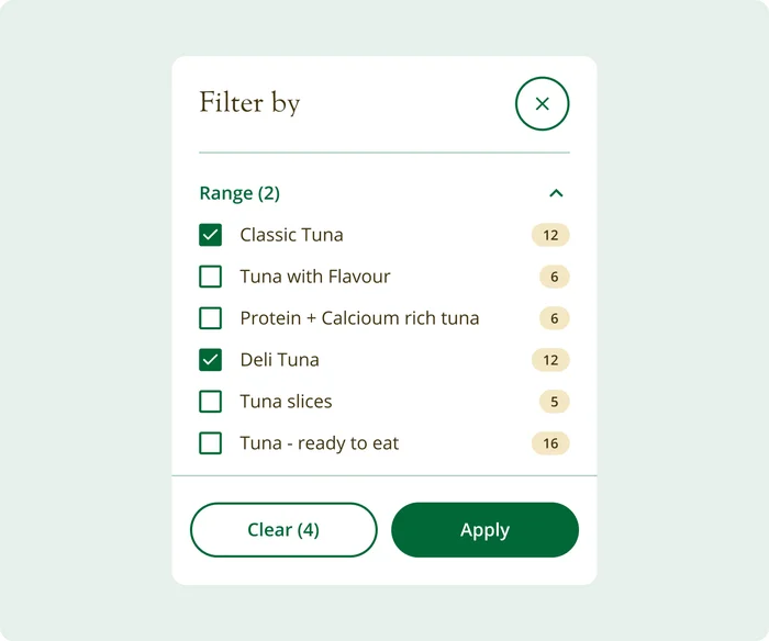
Filtering
Filtering by specific user needs allows customer segments to access information related to each product. Aged care users require texture-modified meals, whereas other segments may be searching for protein, gluten-free or omega-rich products. ‘Best seller’ flags for popular products.
Each site has a filtering capability that also corresponded to the recipe pages. The filtering and grouping of products would also support the growth of the recipe collections and potential new product ranges, with the ability to analyse the filters and product information that is being searched by users.
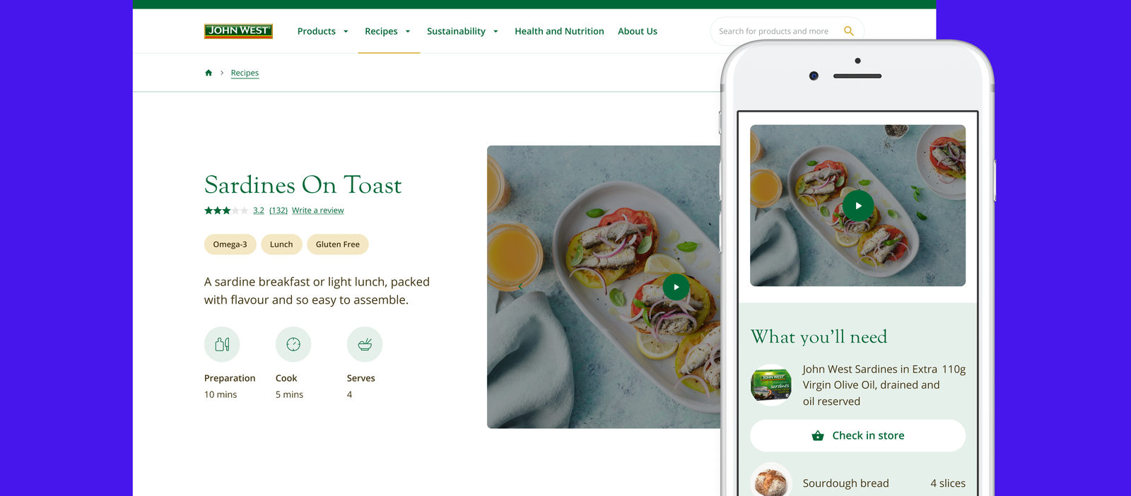
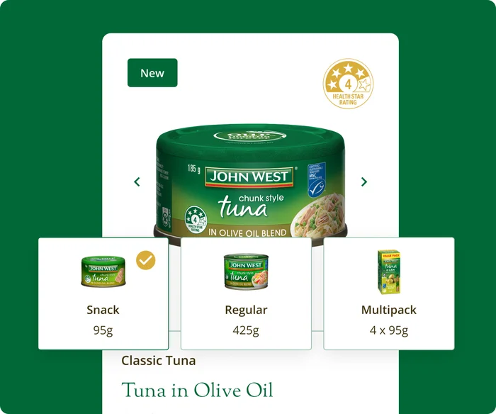
Product information
The current John West site had individual product pages for each size of tuna can, rather than one page with the option to select different sizes. Singular product pages created a seamless presentation of products and reduced the amount of duplicate content on site which would impact SEO performance. Users could easily toggle serving sizes to enable easy viewing of nutrient highlights.
Presenting product information in a more intuitive way better showcased the range without sacrificing any product details as the size variations and pictures were clearly visible
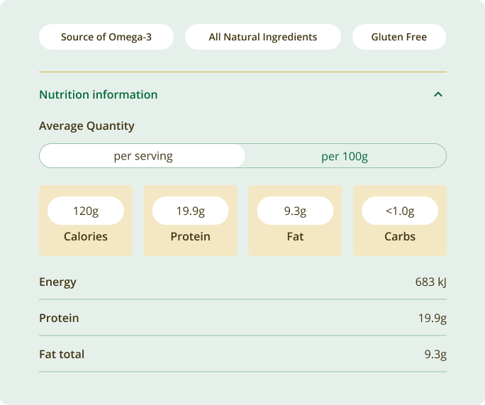
Nutrition
The existing websites often had nutritional information found below the fold, rather than prominently displayed within the product information. For the aged care sector, nutrition information allows for easy navigation of key decision-making for both chefs and nutritionists tasked with creating food that not only tastes good but meets medical needs and industry standards.
Conducting customer interviews with industry sectors and end users elevated the expertise of Simplot, building confidence and trust and providing reasons to return to the site for industry-relevant content and nutrition information.
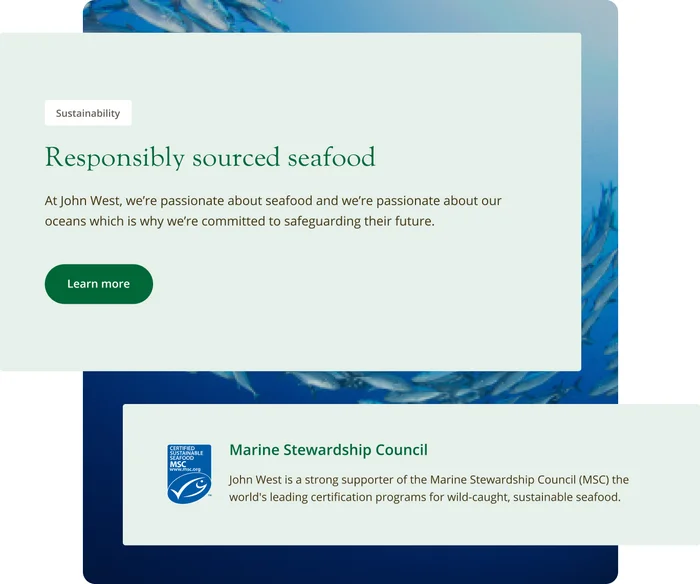
Sustainability
One of the main themes within the market trends, customer research and user testing was the importance of information about Sustainability. It also became clear that sustainability and ethical processes surrounding agriculture, fishing and manufacturing were a cornerstone of Simplot’s brand, despite the limited information onsite. Sustainability and how it relates to Simplot’s brand story were expanded upon to educate and inspire. The sustainability content also focuses on what sustainability means for Simplot across the brands, touching on seafood sourcing, Australian Gown, Australian Made, Recycling packaging and waste reduction.
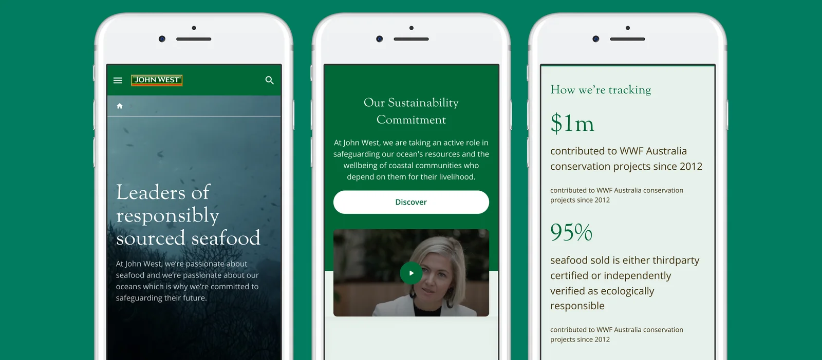
Seeding sustainability sitewide
In addition to sustainability being identified as a key consideration for customers, it was flagged within the strategy work that sustainability content can be expanded to extend organic reach for SEO. It was recommended that setting up a dedicated sustainability page with Parent and Child pages to address FAQs in plain language would enhance the user experience and further shape decision-making, as the current sustainability content had the highest bounce rate.
The strategy team identified deepening brand connection as one of the core pillars of Simplot’s digital vision, and weaving sustainable stories through articles, product information and the brand story would instil authentic thought leadership.
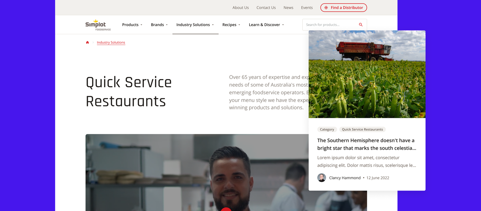
Industries
Simplot provides product solutions to a range of industry sectors, including aged care, healthcare and quick-service restaurants. Simplot’s website required a duality that would service different markets and illustrate relevant information for those diverse end customers, and so dedicated landing pages for each industry were created which housed relevant articles and recipes. Not only are Mcdonald's fries a Simplot product, but so are the calorie-balanced, texture-controlled products that are ideal for aged care groups. Recipe generation and articles related to ingredients further aid buying decisions and confidence.
Informative, industry-specific content
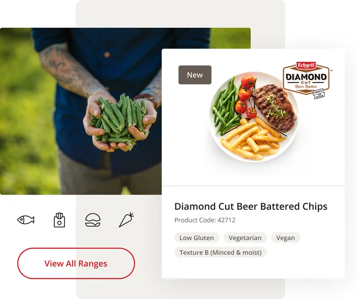
Simplot has a rich inventory of visual content that was not being utilised in a way that would inspire, educate and convert industry customers. By curating each site to showcase the product from its natural origin on the farm to a chef-prepared dish demonstrates Simplot's reputation and offering.
Keep Reading
Want more? Here are some other examples of our work that you might be interested in.