


Rather than sticking with the one gadget, many people tend to jump between devices during different phases of their interaction with your business or organisation. People might first visit your site using their smartphone, but come back later on their desktop, notebook or tablet when they're ready to engage further – or vice versa. You need to cater for every scenario.
The beauty of responsive design is that your website adapts on the fly to cater for different devices and screen sizes. But responsive design is about much more than page layout. It's also about context-aware customisations, anticipating the needs of visitors to let them find what they're looking for and help convert them into customers.
Right place, right time
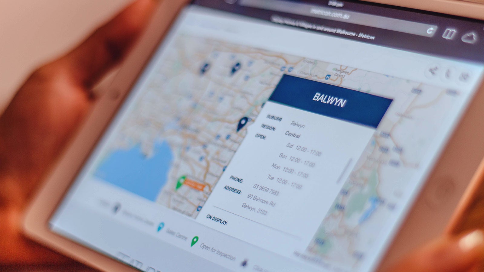
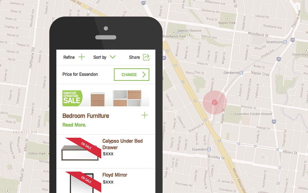
Taking into consideration a visitor's current location is one key way to deliver a tailored experience, ensuring they see content which is relevant to their needs. This might be as simple as determining which state they're in, to offer a clearer picture of stock availability, store locations and delivery fees. This extra bit of location-aware information could be the nudge a visitor needs to move from merely window shopping to placing an order.
Of course the GPS features on mobile devices can pinpoint your visitors' location to within a few metres. At this point you can determine their closest retail outlet and present precise stock and pricing details. If they're only a few minutes away from the store – or perhaps even within the shopping centre – you can offer up discounts, coupons and daily specials in an effort to lure them to the counter.
A responsive website design which responds to a visitor's location greatly increases your chances of getting them through the front door. It can also make your location and contact details easier to find on mobile devices, should they be on the move and trying to find you.
Keep an eye on the time
A context-aware website doesn't just allow for a visitor's location, it also takes into account the time of day and what's been happening recently.
If you're a restaurant, there's no point in handing customers the breakfast menu at lunch time if they can no longer order bacon and eggs. Likewise you wouldn't hand out the wine list first thing in the morning.
Your website needs to make similar smart decisions, to offer visitors the most appropriate content for the time of day. What are they most likely to want right now? Which nearby stores are open late tonight? Is it a public holiday? Taking such things into consideration gives you the best chance of winning their business.
A responsive website which considers the current time can also tie into offline campaigns, from letterbox drops and email promos to television and radio advertising campaigns. If you can anticipate why someone is visiting your site right now, it makes it easier to seize the moment.

Keep an eye on the time
A context-aware website can also alter its look and feel to allow for whether or not you're a regular visitor.
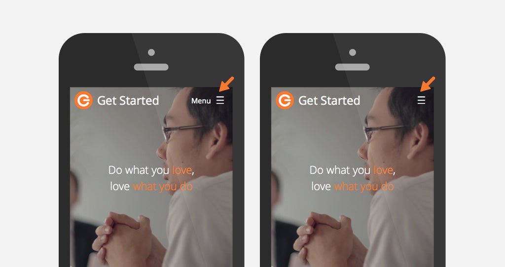
A responsive design website makes it as easy as possible for visitors to navigate your website, regardless of screen size, but those visual cues take up precious screen real estate. Progressive reduction is an approach to the user interface which offers more help to new visitors but gradually scales back as they become more familiar with the site.
First-time visitors might see a pop-up window which guides them through important features of the site. Later this can be scaled back to tooltips which help them discover new features. Text aids such as the word "Menu" alongside the hamburger icon can be removed over time once you're confident that your visitors have mastered the basics of the site.
Your visitors don't just want your website to respond to their various devices, they also want it to respond to their specific needs. Creating a context-aware website is a key element – a responsive design best practice which lets your website take visitors by the hand and guide them down the path to purchase.


Keep Reading
Want more? Here are some other blog posts you might be interested in.


