


Great visuals can make or break a website, which is why intelligent image handling is at the heart of responsive design. Never underestimate the value of great images when it comes to getting visitors to engage with your website. Images are an essential design element which need to be considered every step of the way, not just dropped in as an afterthought. If your images and website design aren't optimised to perform well on all devices then people might not even bother visiting the desktop-focused site you've put so much work into.
Mobile comes of age
In the early days of mobile internet, when GPRS data services were painfully slow yet incredibly expensive, the aim was to serve up stripped-down content to mobile devices. When you only had 40 kilobits per second to play with – slower than what some people were getting on their home dial-up modems – you didn't have the luxury of building rich websites for mobile users. Spartan designs were essential if you wanted people to keep coming back.
Mobile broadband networks and handheld gadgets have come a long way in just a few years. Today's mobile devices are much better at handling large images, thanks to larger and sharper screens, improved graphics grunt, fully-featured mobile browsers and faster mobile broadband speeds. As such it's tempting to overlook the need to optimise your images for mobile devices, but responsive design best practice is to ensure that every visitor to your site enjoys a great user experience.
Responsive imagery provides full-resolution images for desktop websites, when they're serving devices on the other end of a decent internet connection. The idea is to gracefully fall back on smaller images when they're better suited to the job. This might be because you're catering to a small, low-resolution screen where the extra size and resolution of a large image is intrusive or simply wasted. Or it might be that the user is stuck on a sluggish internet connection and you're trying to keep page load times down to ensure your website remains functional.
At the other end of the spectrum, some mobile devices can be more demanding than desktop browsers. For example the Retina HD screen on the iPhone 6 Plus is a bright, crisp 1920x1080 display – sharp enough to do a Blu-ray movie justice. It might be on the other end of a 4G LTE mobile broadband network, offering faster download speeds than many people get on their home fixed-line connection.
Don't play favourites
A responsive design website and flexible Content Management System can strike the best balance for every device – delivering gorgeous, crisp images to powerful devices with ultrasharp displays while ensuring less-capable handsets aren't left in the lurch. People might be passionate about their gadgets, but responsive design doesn't play favourites.
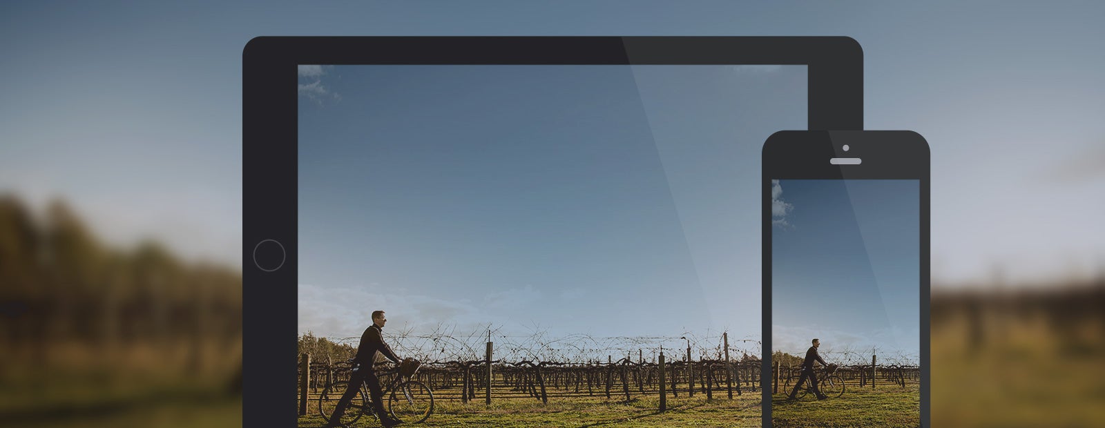
Catering to different devices isn't just about resizing images. Responsive websites need to cater to the aspect ratio of a device's screen, not just the width. This might involve swapping out waist up staff portraits for headshots on smaller screens and calling on an entirely different set of imagery. Or it might mean a subtle crop and slight change in aspect ratio, which end users barely notice but helps with page layout.
Providing appropriate images to all mobile devices is certainly a content management challenge. While desktop sites can offer a terrible mobile browsing experience, it can be just as frustrating when your high-end mobile device is palmed off to a lowly mobile site.
Look your best
Scalable Vector Graphics (SVG) are useful in responsive design, because they're low- bandwidth but look sharp at any resolution. SVG files don't contain an image, they contain the instructions for how to draw an image. This makes them useful for logos and other graphics, because the same image can be served up to any device and you know it will look great. They'll also download quickly because they're only an XML text file.
Current “flat design” trends which use a lot of typography and iconography lend themselves to SVG files. It's possible to create your own custom font file which, instead of containing letters, is full of monochrome, resolution-independant SVG icons. Think back to the days of crazy Wingdings, but using any icons you choose. All browsers have supported custom fonts for many years so, if your design allows for it, it offers a great web design option in terms of performance and scalability.
SVG files aren't practical for photos, but the bandwidth that you save using SVG files for graphics means you can afford to dedicate more bandwidth to improving the quality of your images, so your website can look great even on a slow connection.
CSS fluid image techniques, such as specifying the width of the image as a percentage of the overall width of the page, can also help your images look their best on a small screen. Other responsive design image tricks include using the srcset attribute to specify different images depending on the various attributes of the end device.
There's no magic bullet when it comes to responsive design imagery best practice, it involves assessing the purpose of your website and the needs of your users to determine the best tools for the job. But the end goal is always the same – to offer your visitors the best possible experience, regardless of the bandwidth at their disposal and the capabilities of their end device.

Want to tap into the expertise of an agency that’s been in operation since 1999?
Get in touchKeep Reading
Want more? Here are some other blog posts you might be interested in.


