


The responsive design ethos has a strong focus on best practice, because the aim is to offer your visitors the best possible experience, regardless of their end device. Responsive web design best practice involves catering to screens of all shapes and sizes, which means rethinking your approach to site navigation and leaving behind the desktop-only days of old.
In the early days, desktop design dictated mobile design – even if it wasn't the best choice for a small device. Navigation menus were a prominent design element, stretching across the top of the page or down one side. This approach devoted a large slice of screen real estate to navigation, even when there wasn't much room to spare on small screens with low resolutions. Adopting the visual language of desktop design may have made it easier for new mobile users to find their way around, but it usually delivered a frustrating overall user experience.
Think big on the small screen
The mobile revolution has seen the capabilities of handheld devices come a long way in a short time. Mobile screen sizes and resolutions rival if not surpass desktop devices, while mobile browsers have improved in leaps and bounds. Even though mobile devices are now better equipped to tackle desktop-style websites, the tables have turned and it's mobile design which is informing desktop design.
When screen real estate was such a precious commodity on small devices, mobile-focused web designers began to completely rethink their approach to menus and navigation. The new goal was for navigation elements to take up as little space as possible, while ensuring menus remained effective and were always on-hand when needed.
One with the lot
The desktop-centric concept of drop-down menus which expand when you hover over them does not translate well on touchscreen devices. The desire for hide-away menus on mobile devices saw the rise of the slide-across navigation drawer, often labelled with the "hamburger icon" – three horizontal lines resembling a list or, if you tend to think with your stomach, a hamburger patty encased within a sesame seed bun.
The hamburger icon can trace its origins back to the 1980s, but it rose to prominence in mobile design with the birth of Google's Android mobile operating system and Chrome browser. Sometimes you'll see the hamburger icon appear as three dots rather than three lines.
The hamburger icon has become such a fundamental part of the mobile visual lexicon that it has found its way onto many desktop websites and is considered by some people to be the special sauce of effective navigation. There has however been a recent backlash against the hamburger icon, with some designers simply using it as a mobility shortcut rather than truly focusing on a mobile-friendly design.


Taste-test the menu
There is certainly a place for the hamburger icon in responsive design, but it is not the be all and end all of navigation tools. The idea is to guide users on the journey to find the content they're looking for, keeping in mind their end device, rather than adhering to the strict information hierarchy of traditional menus which often doesn't guide visitors in a linear fashion. Redesigns which don't actually consider the needs of the end users are unlikely to deliver the desired results.
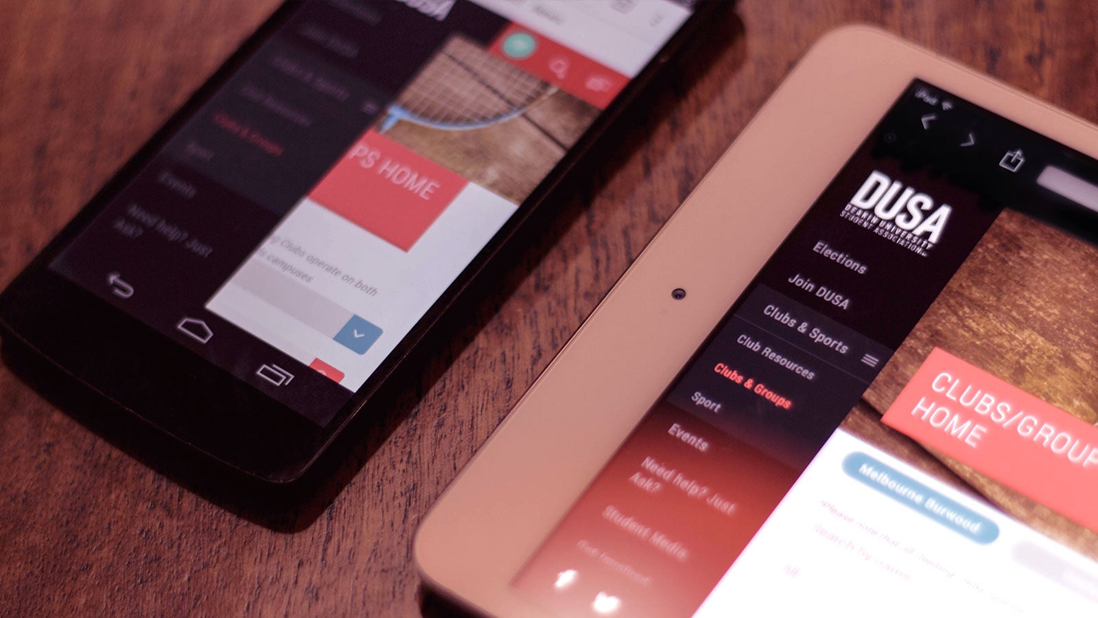
Common practice is to employ a full horizontal, or vertical, navigation bar on desktop-style page design, which elegantly collapses into several tabs and then the hamburger menu on smaller devices. Deakin University Student Association's website, designed by Luminary, offers a good example of a website which adapts its navigation structure on the fly to allow for the width of the page.
There's more than one way to approach menus and navigation drawers, it's a matter of finding what suits your needs and visual style. DUSA employs a slide-over menu which comes across on top of the main page. Meanwhile "off-canvas" navigation drawers actually push the main page aside to reveal the menu.

The CGU website relies on an off-canvas menu which sits above the page.

Clipsal's home renovation site utilises off-canvas menus which appear on the left.

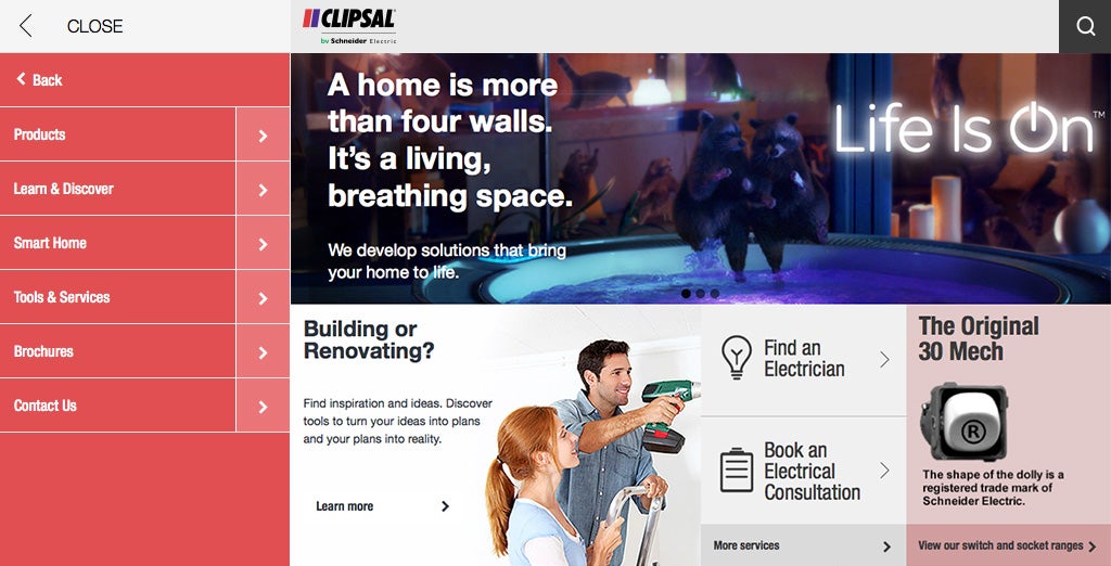
Clipsal also offers an example of how to approach complicated submenus on small screen devices where traditional drop-down menus can become cumbersome. Each sub-menu slides out above the last, so screen real estate isn't sacrificed as users delve into the site.
To provide a consistent user experience, Clipsal also employs fixed or "sticky" navigation tools which remain in the same place on the page as you scroll down. It's an effective navigation concept due to the height of mobile-friendly pages and has become such a core part of web development that it has been added to the constantly-evolving Cascading Style Sheets standard used to build modern websites. Browser support is currently low given its recent addition, but will grow over time as new versions of browsers are released.


Other responsive design tactics for better utilising space on small screens include moving, rotating or simplifying the menu layout as the page narrows. This might involve removing menu options or changing from text to icon-only labels. Bedding retailer Snooze's responsive design website goes through several menu design interactions as it reconfigures on the fly to allow for screen size.
Responsive design offers more than one way to approach site navigation but they're all striving for the same goal – to provide the best user experience regardless of the end device. Building mobile-friendly websites shouldn't mean accepting off the shelf, one-size-fits-all web designs, not when responsive design offers the flexibility to suit every taste.

Keep Reading
Want more? Here are some other blog posts you might be interested in.


